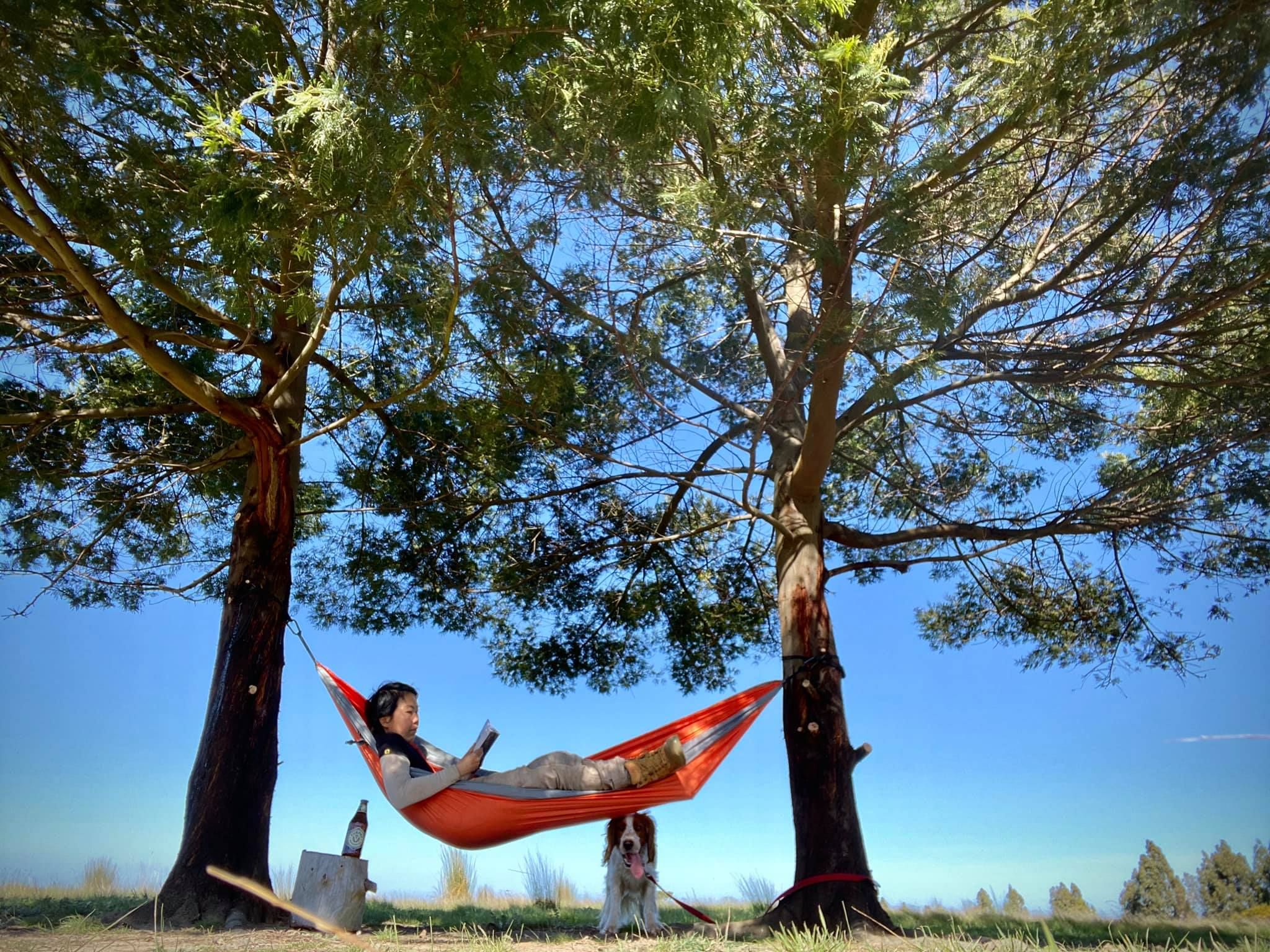
The best UX isn’t on a screen. It’s a hammock, a book and no notifications.
“So what are your plans over the long weekend? Back to the farm?” My colleague asked.
“Oh yes. I will be under a tree. I will be horizontal, but I will be under a tree nonetheless.” I replied, deadpan.
I have been feeling perpetually tired lately. The physical world is excessively noisy and oftentimes – mentally draining. The farm offers a space for solitude, away from people, surrounded by nature and animals. Annoyingly, I have nice neighbours (they are really nice – I am just grumpy). I have a lofty hope of one day buying all the surrounding farms around mine and creating the ultimate buffer so no one can wave at me within a 100-acre radius.
But the farm isn’t just about getting away from people – it’s about being in a space where nothing digital is competing for my attention. The digital world is so noisy. Deliberately noisy. Maybe that’s the innovation we need in UX.
Distraction is not a side effect of modern UX – it is a business model. Every app, platform and device is distraction by design – the moment you unlock your phone, an entire economy is competing for your attention – not to provide value, but to extract significant time and energy off your day.
Dark patterns shape how we interact – often without us realising it. Take infinite scrolling for example – keeping us trapped in a loop of constant scrolling for the next dopamine hit of fresh feed (just like playing the slots). Autoplay removes the agency of making choices to continue, herding us from one content immediately to the next. Notification badges and prompts taps into an inflated sense of urgency – making even the most trivial updates feel important.
These aren’t neutral design choices, but rather, deliberate, data-driven manipulations of human behaviour to interact and engage. UX design optimised for addiction, rather than value and meaning. Good UX is often heralded as seamless and intuitive. Frictionless. But does users actually benefit from endless and excessive engagement?
Perhaps we need to rethink UX. Perhaps it isn’t about making interactions frictionless, but designing intentional gaps. Just like how I’m intentionally stepping away from both the physical and digital to create a gap. For deep focus, thinking and rest. Perhaps we need to do the same for digital spaces as well. A space that is not chaotic, not overwhelming, not addictive.
Think of it as white space, but not just as a design principle – but as an interaction model. With silence being the core feature. Friction as a function.
A UX experience that is not about efficiency or higher engagement – but making it easier to walk away.
Something to mull about. But for now, I will be under a tree. Horizontal.
Pictured here: An Anti-UX moment. I say that with full irony, as someone who works in Digital Design.