Google Design just posted a newly launched design system for Android XR experiences – Jetpack Compose Glimmer.
With the race towards display AI glasses – Apple entering the space, Meta positioning away from VR and leaning into wearables, Google reattempting smart glasses (full circle from Google Glass, remember Glassholes?) – very interesting time in the UX/UI space.
Some of us remember the good ol’ days of screen-based UI. Slicing tables for HTML layouts – fixed widths, designing for different screen resolutions. Then mobile sites. Then mobile-first. Then responsive and adaptive design. Making layouts as reflexive as possible to keep experiences consistent across devices.
With mobile the environment was relatively controlled – still a frame and a boundary. Users might be walking, one hand, two hands, horizontal on the couch – but the interaction lived inside a device. In spatial UX, 360 VR is still controlled. AR extends into the real world but still through a mobile device.
Display AI glasses shift this entirely – you are designing for something worn for long periods of the day, within someone’s field of vision as they talk, move and navigate public space – designing through someone’s eyes.
One detail in the Google post that stood out – we’re not designing on the surface of the lenses, but about an arm’s length away. The UI does not intrude directly into the line of sight. It sits at a distance, waiting to be engaged – the user shifts focus to trigger it.
Sure – we have used gaze input in VR, but gaze inside a fully synthetic world is different from shifting focus away from reality.
That changes the UX/UI language we’re accustomed to. The UI must be responsive, yet respectful. Present but non-intrusive. Overlaying UI onto reality – how do you ensure that it doesn’t pull users away from the world they are physically and socially present in? That it complements rather than distracts? Complex design problem.
There are other shifts. Typography is no longer just readability and legibility – now we’re talking glanceability. Micro-attention and peripheral perception, visual hierarchy that holds against dynamic real-world backgrounds.
Despite all these shifts – Typography. Colour. Contrast. Visual hierarchy. The language of UX and UI evolves with technology – it always has. But design fundamentals are timeless.
I’m keen to buy a pair of display AI glasses. I tend to be an early adopter – mostly because it’s important to see where the technology is headed. Though I’m convinced product launch dates are planned around me – a far more advanced model will be announced the INSTANT I unbox my first pair. 😒
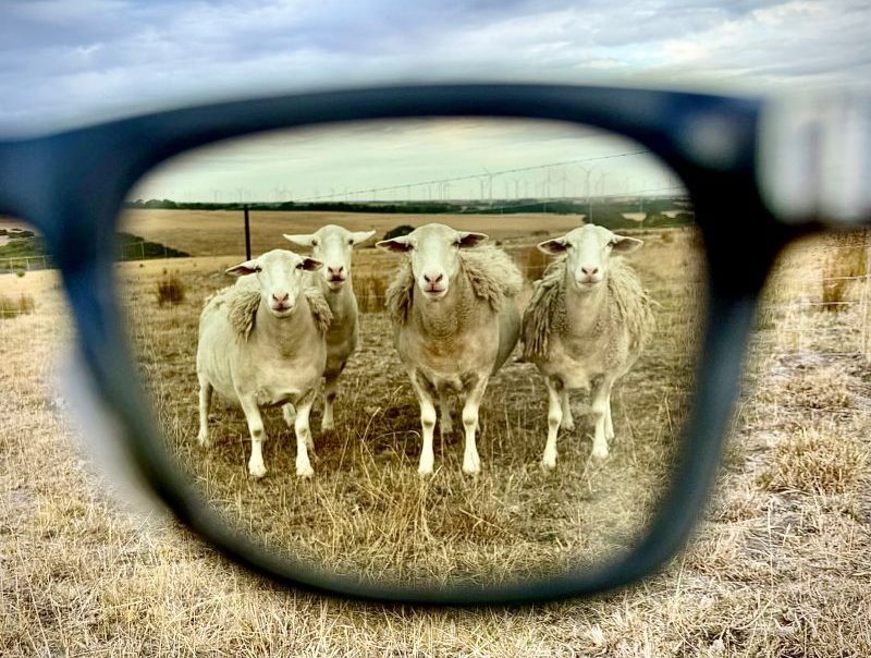
Pictured above – not AI generated. Just my photogenic sheep and my Ray-Ban Meta held in front of my phone. See, we don’t need AI slop for everything. Some originality, photography skills and cooperative sheep will do.